Let’s get one thing straight: Instagram Stories have changed the Insta-game. Since launching in August 2016, they’ve allowed us to create content in an exciting new way, promptly nudging Snapchat into the corner.
After years of focusing on nothing but #gridgoals, finally we have a more playful way to share daily content, experiment with fun features such as Create Mode, plus get a more authentic peek into the lives of others. Instagram Stories now has more than 500 million daily active users and with new updates added weekly, it’s only getting better.
The Instagram Stories platform continues to evolve with regular updates and Instagrammers upping their game with slick operations and clever techniques. Want the hottest strategies and tips on how to use Instagram Stories? Read on…
# 1 Tell your Instagram Stories
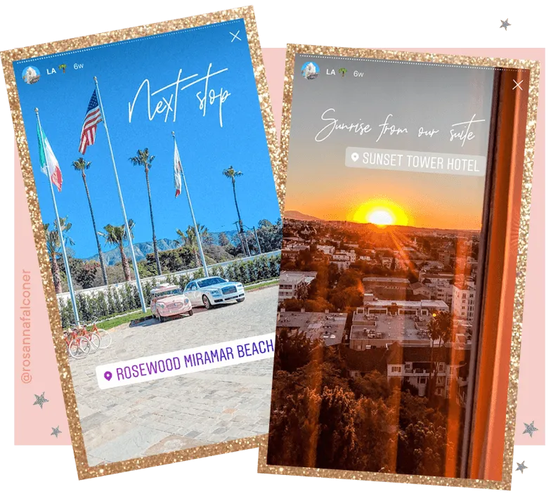
In the same way that your grid represents your brand, Stories do too so I spend time curating both and making them a part of the same tale. I share content as a complement to my grid — it allows me to narrate a more detailed, behind-the-scenes journey and bring my day to life.
I’ll often show video footage of the process behind the final, filtered image that appears on my feed, whether that’s how I baked a fancy cake or how I chose what to wear for an event and asking my followers to interact by voting for their favourite look on a poll. I find that creating an engaging and often literal story brings in regular viewers and increases the completion rate then they go to your feed to see (and hopefully like!) the finished product.
I share content as a complement to my grid — it allows me to narrate a more detailed, behind-the-scenes journey and bring my day to life. – @rosannafalconer
#2 Hero the 9×16 Instagram Stories format
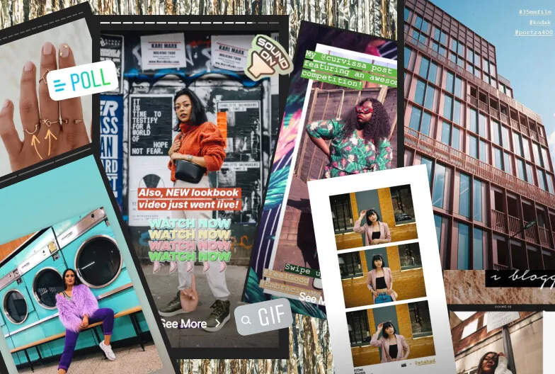
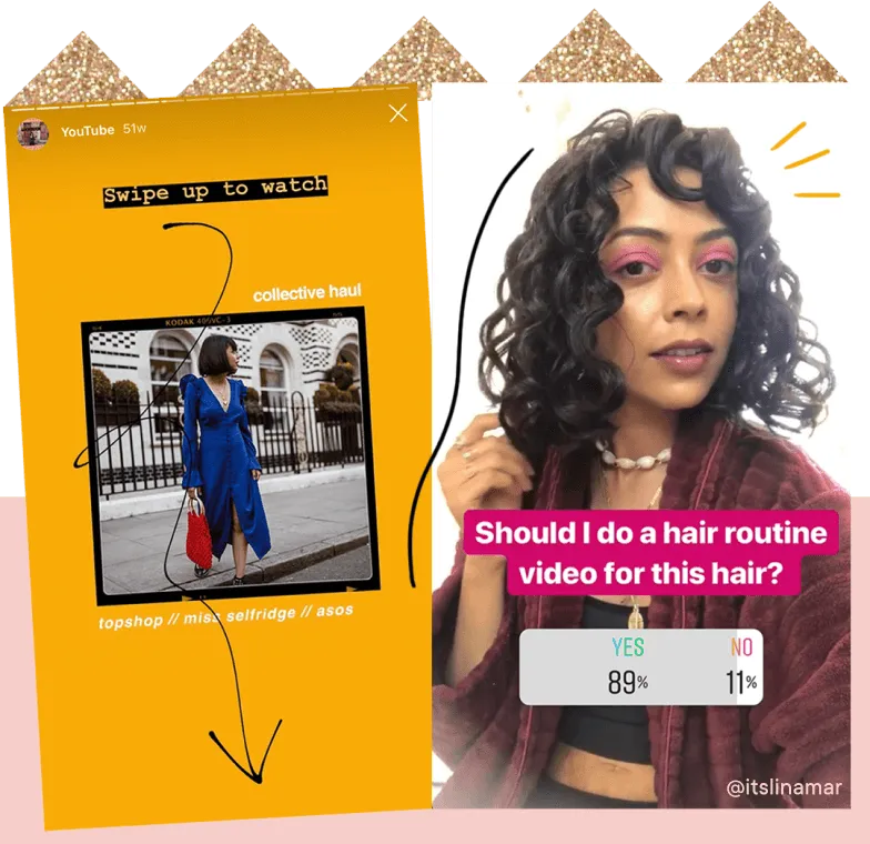
I’m always aware of the content that fits best on Stories. As it enables you to share a slideshow of 15-second snippets, which disappear in 24 hours, I keep each section short, snappy and ‘in the moment’. Consider the 9:16 ratio template and shoot your images or videos vertically so you can fill as much space as possible. Make the most of the various tools, too, from geotags to hashtags and different fonts. My favourite is polls for interacting with my audience and gaining instant insights.
Consider the 9:16 ratio template and shoot your images or videos vertically so you can fill as much space as possible – @itslinamar
#3 Be authentic
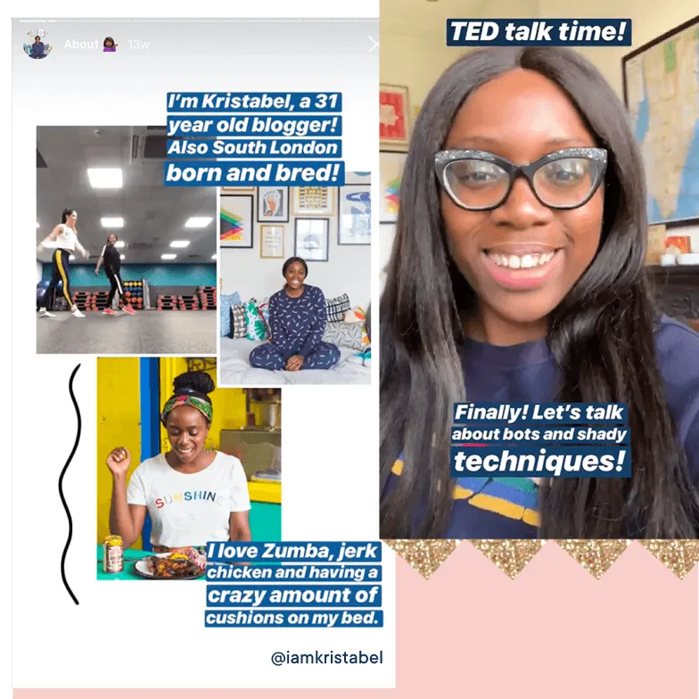
I find chatty clips work best so I try not to be too precious when it comes to my Stories. I’ve started my own version of TED Talks where I openly discuss relevant subjects for my audience to engage with, then I’ll add the summary to my Highlights for people to watch whenever they like. I write a loose script beforehand but mainly improvise and keep it real. I also include text to summarise my chatter, which is handy for those who are watching without sound. For consistency, I’ll stick to the ‘Strong’ font because, well, you can’t miss it!
I’ve started my own version of TED Talks that I’ll add to my highlights. I also include text to summarise my chatter which is handy for those who are watching without sound – @iamkristabel
#4 Get on the Instagram Stories Tools
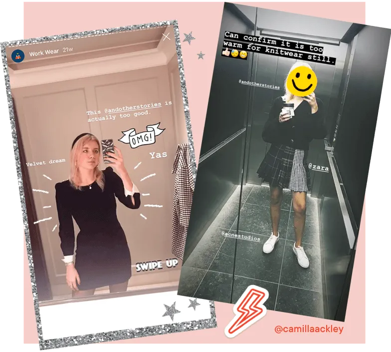
My Stories are much less stylised than my grid — I want to keep that low-key, life update vibe. But I looove GIFS. I load them on because they make everything much more playful. My tip? Stick to the same type of GIFs, whether it’s illustrations or slogans, in order to maintain that consistency.
Stick to the same type of GIFs, whether it’s illustrations or slogans, in order to maintain consistency. – @camillaackley
#5 Try Instagram Stories editing apps
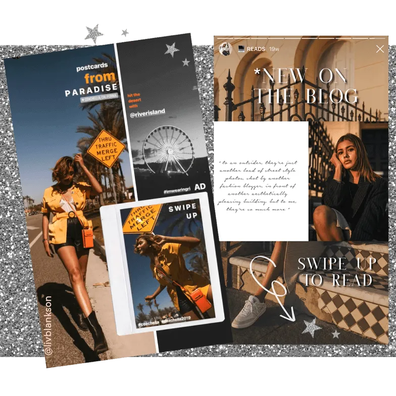
Instead of sharing content on the fly, which can get messy, try one of the many editing apps outside of Instagram that help to make your Stories stand out. If you’re bored of the five fonts that Instagram offers, try adding different text and colours using Over. I love Unfold, which offers a whole host of borders, filters, texts and backgrounds. The retro film and polaroid frames are my faves. InShot, Canva and Hype Type are also worth checking out until you find a template that works for you.
I love Unfold, which offers a whole host of borders, filters, texts and backgrounds. – @livblankson
#6 Make the most of Instagram Stories Highlights
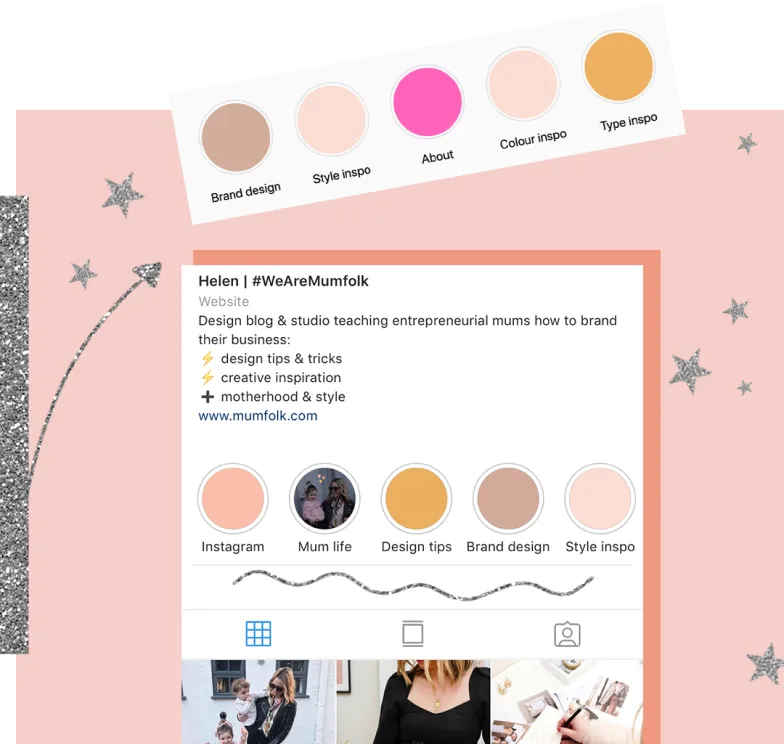
Think about your IG profile like your website homepage – therefore treat your Stories Highlights like your navigation links. Highlights are front and centre on your profile so make sure they showcases all of your best content. Much like the navigation links on your website, Highlights should focus on all of your main content areas and the goal is to entice new visitors to hit follow by showing off your brand style and what you’re all about. Get creative with your Highlight cover pages, use your brand colours, add a custom pattern or icons to bring your different Story types to life.
The Stories highlights are front and centre on your profile so make sure it showcases all of your best content. – @mum_folk
